An image equals a thousand words as they say. Totally true.
The importance of a good cover
Like I have mentioned before, your book cover is probably the single most important element that will attract peoples’ attention (and sales). Unless your book cover isn’t carefully and professionally designed, it can ruin your book for good.
Especially on Amazon, you can only initially judge a book by a small preview of the cover and the title. In that sense, you have a very short period of time to capture the customer’s attention. If you don’t, you will most probably lose a good sale.
Design vs outsource
Depending on the cover, sometimes I design them myself, but I have also streamlined a method of outsourcing them as well. These days you can get a professional book cover designed for as low as $5 or $10.
The good thing about outsourcing the covers is that the business can scale more easily. Especially if you don’t have a designer background (like I have), then outsourcing is your only option.
I sometimes prefer to do it myself in order to save some precious time and energy between the back and forth with the freelancer. But this is not always the case. As a newbie, I would definitely go with the outsourcing method.
Using images the right way
As you probably can imagine, images are perceived and analyzed from the human brain way faster than text. So the main image of our cover is of maximum importance.
Must be of high quality
Images of high quality will make your book stand out and look more expensive. Whether this image is a photo or a high-resolution graphic, quality is of maximum importance.
Imagine a book with a cheap cover. When someone sees that, he will automatically think, that the content must be cheap and of low quality as well. So no matter what you do, always use images and graphics of high quality.
Please at all costs try to avoid cheesy and clichè stock images. Nowadays people are Internet savvy and can easily tell between an authentic photo and a stock image. Moreover stick to the K.I.S.S principle. Keep it stupid simple. Unless you’re a highly skillful graphic designer, the more “photoshoped” your cover, the worse it’ll look.
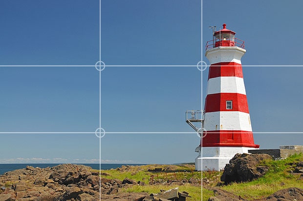
Rule of thirds
Avoid placing the key image exactly in the center of the cover. This way the brain is more intrigued because of the slight “pattern abnormality”.
When you use a single main image on your cover, always use the rule of thirds. That is done by dividing the cover into imaginary thirds both vertically and horizontally. You will need to place the focal point of the image where the dividers intersect.
Watch out for copyright issues
Finally, make sure you don’t have any copyright issues, by using paid or royalty free images. There’s nothing more disturbing than a nicely made cover with a “stolen” image.
It will cause you many troubles with Amazon and the original owner of the image in case he finds out. Better safe than sorry. You should also make sure that you ask the same thing from your freelancer as well. You should be explicit that you want the photos to be royalty free or paid.
Some website I personally use all the time for my photos are:
- pixabay.com (free but limited selection)
- pexels.com (free but limited selection)
- dollarphotoclub.com (high quality stock photos)
- shutterstock.com (high quality stock photos)
- istockphoto.com (high quality stock photos)
- gettyimages.com (high quality stock photos)
Using fonts the right way
After the image, the fonts play an almost equally important role in your cover. You can definitely tell a bad cover from a good cover based on the font the designer used.
This is another benefit of using a freelancer for this task. Usually, designers have a large variety of fonts to choose from, and all the necessary resources for fonts repositories.
Always use no more than 2 fonts
In any case, whoever designs the cover, should never use more than two different types of fonts. Again, the KISS principle is golden. Keeping your eBook cover simple will make it feel more expensive and of good quality. The excessive use of different fonts will destroy the perceived value of your book. It will make it look cheap.
As a rule of thumb, try to combine a serif with a non-serif type of font. This will give your cover the sense of the contrast you want.
Fontpair is a great resource that will help you make smart font combinations. Give it a try.
Must be totally readable
When you want to compete with other books, you should always think what competitive advantage you can offer in battle.
When a reader looks for a book on amazon, he will see many different books (covers) in the page with the search results. This is where your book must stand out, not only due to the image but due to the fonts used as well.
Must look modern
Finally, your fonts should be modern and aesthetically pleasing and easy to read. As the Internet evolves, so do the resources and typography as well. Fonts used a couple of years ago, might now be outdated.
Modern typography wants “clean” font types with minimal design and not that curvy. In general, non-serif, bold fonts work better for cover designs.
But as always there might be some exceptions to this rule.
There are many websites to choose your fonts, but I mostly use:
Now let’s look at two specific examples.
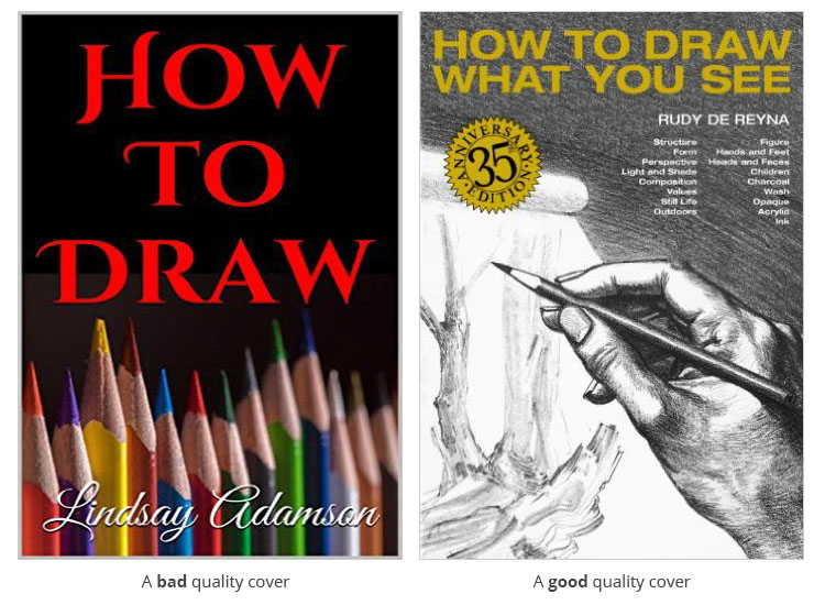
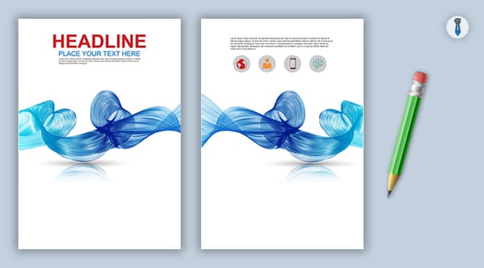
In the above examples, you can see a cover of bad design on the left and the exact opposite on the right. The left one is looking cheaper because the photo is of poor quality and the main font has nothing to do with the subject of the book. Moreover, the author’s name isn’t visible, because the whole color pallet of the cover is badly chosen.
On the other hand, the book on the right has a proper image of high quality and the font type is easily distinguishable from the image.
How to outsource it
OK, let’s say that you have finally decided to outsource your cover. These are the steps you need to follow in order to get a high-quality cover for your book.
Find a good and reputable freelancer
Okay, there are may places you can find a good cover designer like:
But, as an amateur, I would aim for an economic yet quality service. If you are not an experienced publisher, I think you should not spend a lot of money on covers, at least before you get the grasp of it.
The best place I have found for good quality covers at a decent price is fiverr.com. This is probably the best freelancer site for this job. Through fiverr.com, you will be able to find numerous cover designers for your tasks.
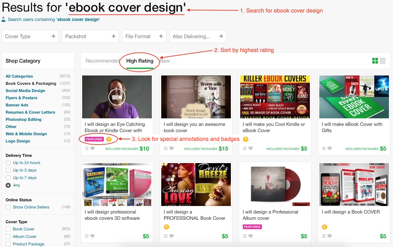
Just create your account and search for any task you want. In this case:
- Search for “eBook cover design”
- Sort the results according to the highest rating
- Look for any special annotations and badges some freelancers have
- Look at the offer and the comments section of each gig
When you contact the freelancer you will absolutely have to:
Be specific about what you want
Unless you are very specific about what you are looking for, it will be difficult for the designer to understand you, and deliver a good piece of job. The more specific you are, the more time you are going to save for yourself.
Give the freelancer a few very specific examples of designs you liked and you think they will be a nice fit for your eBook. Remember, by now you have studied the niche pretty well and you know what works and what doesn’t.
You should by now have seen enough covers and titles in order to get a good grasp of what readers demand in your niche. I would even go as far as give the freelancer a specific design of a book cover I liked.
But always remember! We don’t want to steal other people’s ideas. All we want is some genuine inspiration and a feeling of what the market likes. After you have found a couple of covers you like, you can ask your designer to improve on them with specific ways by using his/her imagination.
Suggested freelancers
Some suggested freelancers I would personally recommend are the following:
For a complete list of all the freelancers I personally use, please visit the advanced resources section here.

